

5 tips for a more professional & less DIY website

How to Sharpen your website to be more professional & boost your marketing
We are a brand studio based in Torquay, South Devon, offering branding, website design & brand video to creative businesses across the UK - this is part of our series of website tips (alongside branding and video), and you can find out more about our website design services for businesses.
Every business is looking for an edge, and often it’s the details that matter.
There are a few key (but surprisingly common) things that often get missed on websites; whether you've done it yourself or they're an oversight by someone else.
Here are five really quick, easy and actionable tips to help you sharpen your website and be more professional.
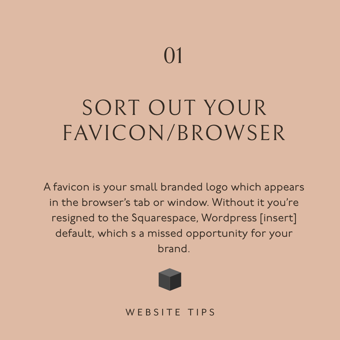
1. Sort out your favicon
A favicon is your small branded logo which appears in the browser's tab or window.
It's a colourful calling card for your business.
Without it you're resigned to the Squarespace, Wordpress [insert your platform here] default, which looks sloppy and is a missed opportunity for your brand.
Here are a few things you can do practically:
Your favicon is small (displays at about 16px × 16px), but size it between 100px × 100px and 300px × 300px
Use an .ico or a .png file as your favicon image
It’s a small file too, so make sure your favicon image files is not more than 100 KB
Read more about favicons on Squarespace in Adding a favicon or browser icon
2. Add a custom thank you page
Maximise your visitor's time on site and exposure to your brand by redirecting them to a thank you page when they've filled in your enquiry form.
Add value through free resources; sign up to your newsletter; your latest blog with helpful info.
Here are a few things you can do practically:
Add a short note on how long it will take to hear back from you - set good expectations
Include an image of you or your client-facing staff to make it more personal
Ideally, ensure that your site sends a confirmation note with a copy of the enquiry for everyone’s records
Read more on post-submit redirects in Squarespace: Form Blocks post-submit redirect
3. Remove the default byelines
Platforms often come with 'powered by Squarespace/Wordpress' text etc.
Get rid of it. No one needs to know or cares. It's a waste of valuable page space.
Create a thoughtful footer 'doormat' with key info in case people miss it further up the page.
Here are a few things you can do practically:
Things to add for consideration:
Key pages: contact, about, blog, services
Days and hours of work
Links to social media and reviews
How to in Squarespace: Removing "Made with Squarespace" from your site
Read more about the rationale behind a footer doormat: Footers 101: Design Patterns and When to Use Each
4. Tailor submission text to your brand
Bring personality to your brand experience by tailoring the stock text generated for newsletter sign-ups, enquiry submissions or product orders.
It's often bland and American English.
Show off your brand character and creativity with personalised text!
Here are a few things you can do practically:
Newsletter sign-up: remind subscribers to check their spam or junk folder
Contact form: confirm that it has been submitted safely and when the visitor can expect to hear from you
Product order: clarify what will happen next and add something personal - the sky’s the limit!
5. What's the one thing?
This is important - avoid too many or no call to action (CTA) on a page.
Too much choice is paralysing; no CTA is a waste.
Ask what's the purpose of the page and create a clear, purposeful next step.
Think about the customer journey on your site from arrival to exit
Help people get to know you or your brand before going for the jugular
Ultimately, guide people to the ultimate action, whether contact you, sign up or buy


Lastly, put yourself in your visitors shoes - what would you want to see? What would put you off?
These are our tips to help you get started with defining your ideal customers and what they look like, and we’d love to hear any of your thoughts or reflections. Do head over to the corresponding post on Instagram to join the conversation and share your opinion.
If you’d like to receive our studio e-mail which we (usually) send out on a Tuesday, pop your details in below.
We share website and branding tips; insights into brands we create; behind the scenes in our studio; as well as interesting events. Plus there are no silly marketing antics!